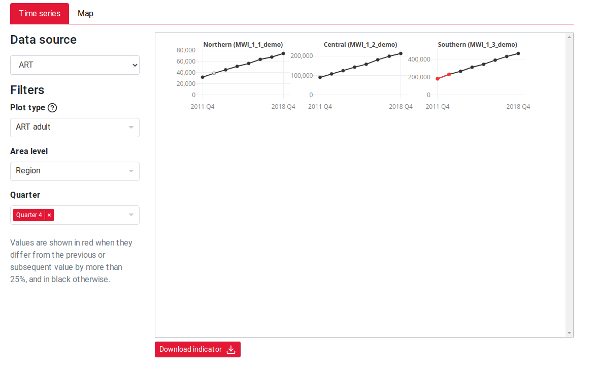
We’ve made an update to the input time series to more clearly show missing input data. The input time series is used to display time trends of input programme data, the plots show the raw data and aggregates at admin levels. If the input data has a missing value for a region we now display this as a greyed out circle. When an aggregate contains a region with a missing value previously that was shown as 0. We now aggregate the data that is available and show this point in grey if any are missing. If you hover over the point the tooltip will give you information about how many regions are missing.
