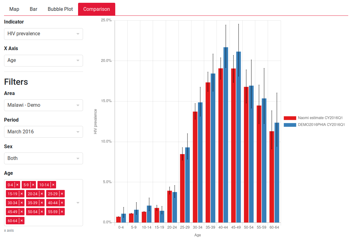
We’ve released a new output plot type which you can use to review model results. This can be accessed from the “Review output” step under a new “Comparison” tab.

You can use this plot to review differences between input data and model outputs. Using the filters you can select which indicator to visualise and which variable to display on the x-axis. We recommend viewing indicators such HIV prevalence, ART coverage and key ANC indicators by sex and region. Please note for many input data indicators only few aggregate data points are available for comparison.